We're making further changes to improve the ease of access to content on the ripe.net website.
For the past year, we’ve focused on improving the user experience of www.ripe.net. Our initial efforts were centred around the website redesign and technical developments, such as improving the effectiveness of our search functionality, as outlined in previous RIPE Labs articles. Along with these efforts, we also plan to rearrange the navigation menus to make content easier to find.
The Megamenu
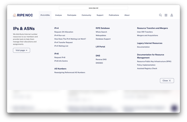
The megamenu is the menu you see once you click on any of the top-level navigation headers. This megamenu, visible upon interacting with any top-level navigation header, is a pivotal feature in our user interface. Our goal with refining the Megamenu is to ensure that users are no more than two clicks away from the information areas they need.

Planned changes
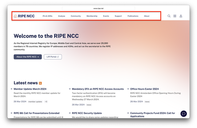
We will be reorganising the megamenu navigation in phases to prevent our regular users from being too disoriented, and also allow us to incorporate any feedback that we receive in the process. Here’s what we have planned for our first round of changes, scheduled to take place in the first week of July:
- “Events” added to the top level
- “Participate” renamed to “Membership”
- Additional content under “Community” including Policy Development and Internet Governance
In the first phase, we will focus on three sections - membership, the community and events. These changes are designed to better cater to our diverse user base. We organise approximately seven in-person events in a year and several other online ones, with a few thousand attendees all combined. The new "Events" section will provide more streamlined access to event-related information, making it easier for our attendees to find what they need.

Another change will be to relocate content that was previously grouped together under the heading of “Participate” under two headings: Community and Membership. We publish a lot of information for our members, and having it in one place should make it quicker to find. The RIPE community is vibrant and multi-faceted. Aggregating community activities and initiatives in one cluster should also make engaging with RIPE a click faster.
In our next round of changes, we will re-organise content that is currently grouped under “Publications” and “Support”. “Training” will appear as a new top-level header, providing easier access to all the training and certifications we offer. We will also group and streamline the sub-headings inside the megamenu to improve clarity.
All our tools and services that are available as independent applications such as the RIPE Database, RIPE Atlas, the RIPE NCC Academy and RIPE Labs will continue to be available through the app switcher icon in the top right corner of the menu.
Which content do you access the most?
Your input helps shape our efforts to refine the navigation and improve ripe.net to ensure it meets the needs of our diverse and active community.
If you have any thoughts about content that should be easier to access, or other improvements, we’d be happy to hear from you over on the RIPE NCC forum.


Comments 0