Following RIPE Atlas, RIPE NCC Access and RIPE Labs, the RIPE Database and LIR Portal have been redesigned to match our new UI template for RIPE NCC services.
For the past year, we've been working on improving the usability of our services. You may have already noticed the app-switcher up in the top righthand corner of ripe.net, or you've perhaps already seen that RIPE NCC Access, RIPE Atlas and RIPE Labs have a new look.
One of the principles of the new design, as explained in an earlier RIPE Labs article, has been to remove clutter from our interfaces, making them less confusing and giving each service more “property” space in the browser to define its own content. At the same time, we've worked to bring everything in line with a unified template, to ensure consistency across the services we offer.
As part of this effort, we've now given the RIPE Database and LIR Portal a face-lift too!
What Are the Changes?
Change No.1: We’ve introduced the new blue theme provided by the new interface template.
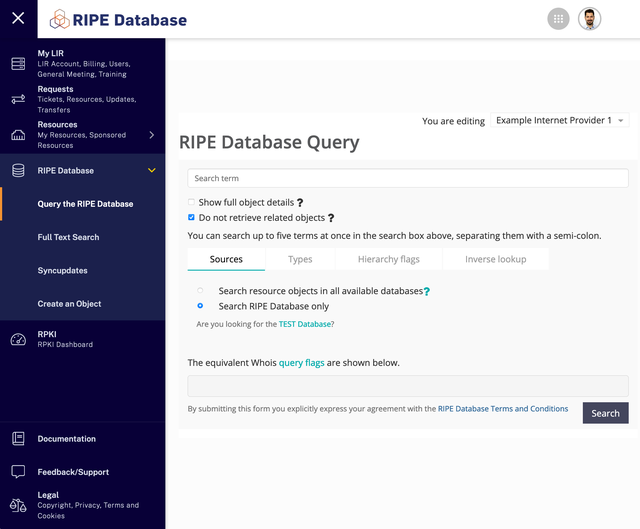
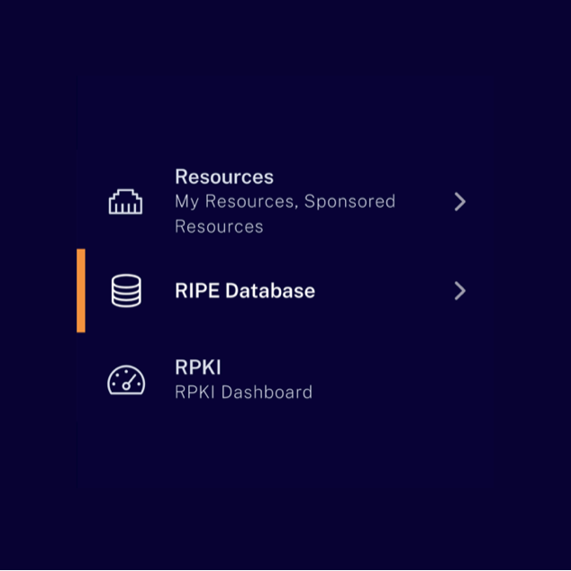
Change No.2: We’ve highlighted RPKI.
You can now easily access the RPKI Dashboard from the RPKI item in the app-switcher, and we’ve added it as a main item on the left side menu.
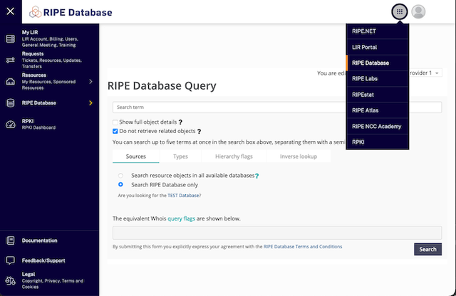
Change No.3: We’ve rearranged some items in the left side menu. This is explained further below.
A Bit of Inside Information
Let's assume you're logged in and have access to the LIR Portal. If you visit the RIPE Database, you'll then see several options in the left side menu - e.g. My LIR, Billing, Training, Tickets, RPKI Dashboard, etc.
All this functionality is in fact provided by three different applications and the left menu is copied in each of the apps: the RIPE Database and then the LIR Portal, whose content is served by the legacy LIR Portal and its newer version.
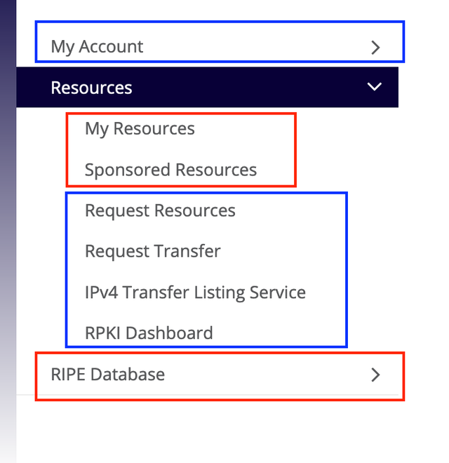
You can see how the URL changes -- lirportal.ripe.net, my.ripe.net, apps.db.ripe.net -- as you navigate to different items in the menu and you might also have noticed a few visual inconsistencies in fonts, layout, page rendering, and so on.
What’s Changing in the Menu and Why?
As mentioned above, the goal is to have the RIPE Database and LIR Portal define their own content, and not to share a detailed common menu structure anymore. Ideally, we would like to move the LIR Portal content out of the RIPE Database app, and vice-versa. However, this can be very confusing at the moment for our users. What we are doing instead is separating the sub-menu items that belong to different apps by rearranging items in the menu and simplifying it.
More specifically, we have:
- Created a new main menu item, “Requests”, and moved under it the sub-menu items related to requests to the RIPE NCC
- Renamed “My Account” to “My LIR” - referring to their 'RIPE NCC Account' and 'LIR account' has caused confusion in the past
- Simplified the menu so users can focus on the important items of each section
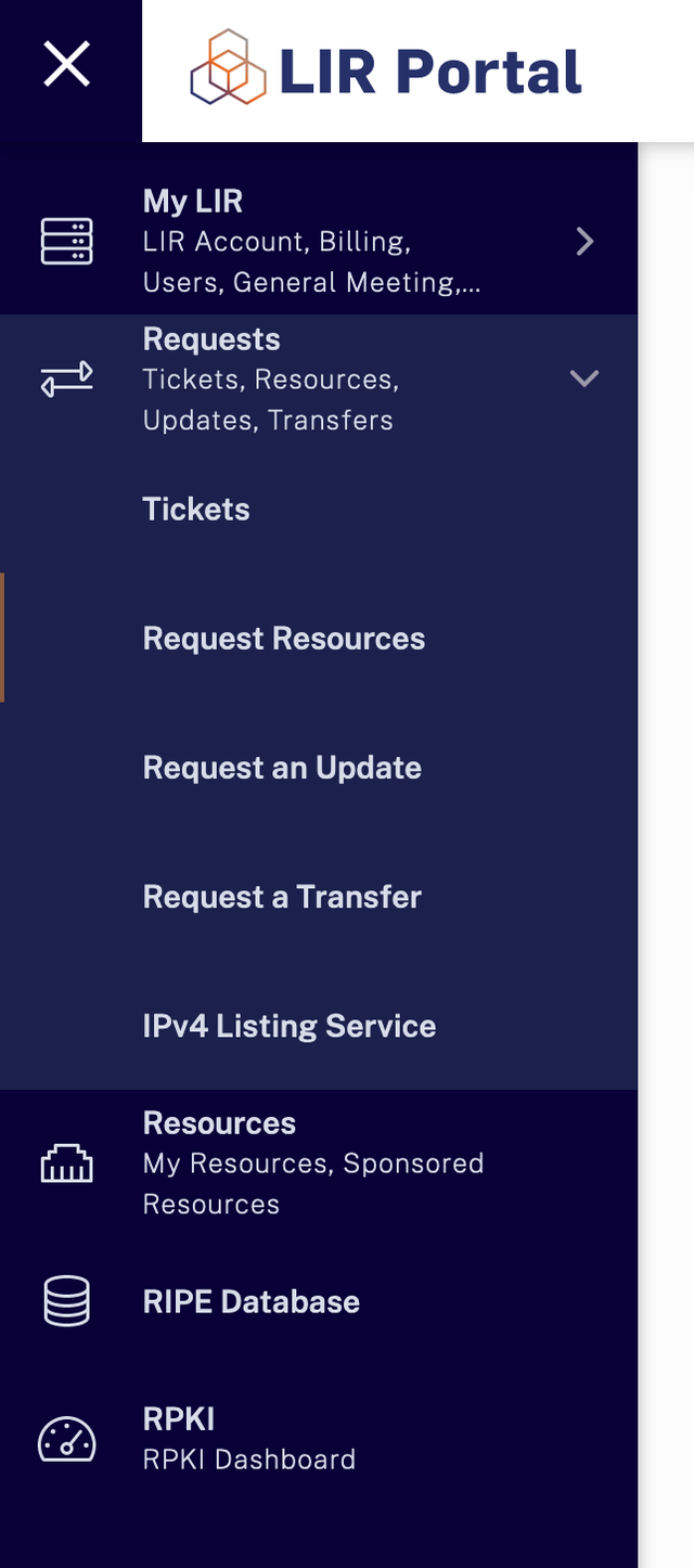
There are a few reasons behind this change:
- A cleaner interface - users don't necessarily need quick access to detailed billing info or general meeting links when working with the RIPE Database
- Now that we have the app-switcher, and cross-linking is in place between the two apps (e.g. transfer/request resources from “My Resources” or links to the RIPE DB objects from the LIR Portal), it's much easier to navigate from one app to the other without clicking on the menu items -- this way, we’re also helping our users understand better the functionality of each group and application
- Having a common menu shared between three different applications has proven to be a maintenance burden, duplicate work, and a source of inconsistencies -- so we would like to spend our energy on more meaningful efforts to serve our community
Next Steps
In the coming weeks and months, we'll be gathering some analytics to see if we need to improve the cross-linking between the two applications, or adjust our plan in general. But we would also very much like to get your feedback directly. While we hope you like the new changes, do let us know what you think. You can comment on this article, or use the feedback feature on the apps directly.



Comments 0
The comments section is closed for articles published more than a year ago. If you'd like to inform us of any issues, please contact us.