When re-designing www.ripe.net, we paid extra attention to how we can improve the interface for the Policy Development Process (PDP). This open and transparent process determines RIPE Policies, which govern the distribution and use of nearly all Internet resources in the RIPE NCC service region. Our aim was to make it easier to review policies and proposals and encourage participation in policy discussions. This post explains these improvements in more detail.
RIPE Documents
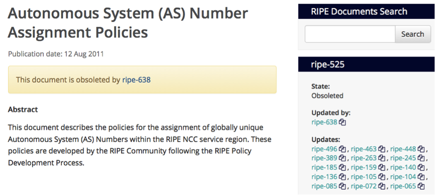
All RIPE Documents - including RIPE Policies - can now easily be reviewed as they evolve. A widget on the right side of the policy page shows all the previous versions of a document (below, "Updates"). If you are viewing an obsolete document, the widget shows the documents that obsoleted it ("Updated by").
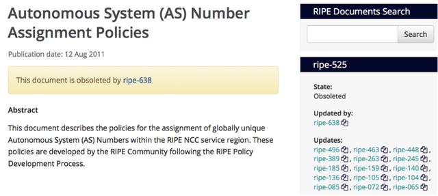
Clicking on one of the RIPE Document numbers brings you to that specific version of the document.
Did you notice the little “double-page” symbol after each document number? Look again:
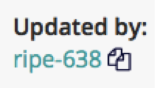
Figure 2: Feature to compare different versions of a document
During the website redesign, we implemented an automatic tool to allow easy comparison between different versions of the same document. This makes it much easier to see changes between the document versions. In the following example, a word has been replaced in Section 3 and a new Section 4 has been added.
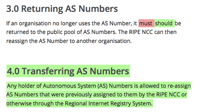
The more iterations there are between two compared versions of a document, the more content is likely to have been changed. The tool also compares HTML content, so even minor changes such as extra spacing are shown as differences.
Each RIPE Document now has an ASCII file attached to it. This was done in response to requests from the community to provide plain-text versions of our documents.
Besides this functionality, we also gave all RIPE Documents a new style, with a larger font and slightly looser spacing, to increase their readability.
Policy Proposals
The main focus of our work on the policy proposals was to improve usability. After receiving comments that it was not clear how to respond to a policy proposal, we included a clear access link from each proposal to the relevant working group.
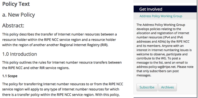
Next to the policy text, we added a “Get Involved” widget that provides a one-click solution to subscribe to the relevant working group, review the archives and join the discussion.
Just below that, we added a “Contact” widget for people who would like to contact me directly. If you have a question on the development process, if you want support for your own proposal or if you need information about previous proposals and discussions, you can use this widget to contact me.
The widget includes my Twitter details in case you prefer to get the latest PDP updates this way.
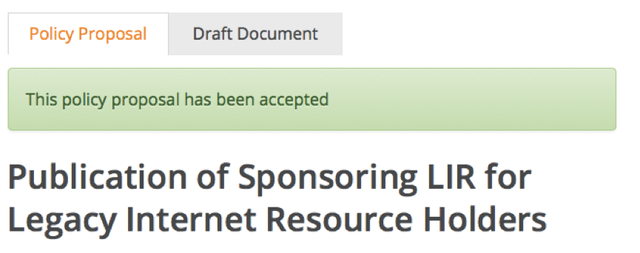
We also worked on the visual clarity of the policy proposal pages to make it easier to see when a proposal has been accepted or withdrawn.
We think these improvements will make it easier to review RIPE Policies and policy proposals. In this way, we hope the new design will encourage participation in the Policy Development Process. We look forward to seeing more of you getting involved in RIPE Policy discussions.
We also welcome any suggestions for further improvements on our website. Simply send an email to pdo@ripe.net .



Comments 0
The comments section is closed for articles published more than a year ago. If you'd like to inform us of any issues, please contact us.