User experience design is not about trends, it's about solving real problems. The team behind the RIPEstat talk in depth about the design journey they undertook to create the latest iteration of the UI.
At the RIPE NCC, we approach user experience design with a focus on addressing the unique and often complex challenges found in the Internet infrastructure landscape. Yet, last year we faced an unusual UX dilemma with RIPEstat, as discussed in recent RIPE Labs articles.
RIPEstat is an essential tool providing authoritative data and analytics on IP address space and Autonomous System Numbers (ASNs). Network operators, developers, security researchers, law enforcement agencies and academics worldwide depend on the tool's reliability, speed, and ability to provide in-depth insights at a glance.
For years, RIPEstat operated with two parallel user interfaces, each with its loyal fans and critics. Maintaining both was not only unsustainable, but it also caused confusion among users and divided internal resources. Our mission was clear: determine which interface to focus on and ensure that it best meets user needs. However, the path to this decision was anything but simple.
The challenge - navigating complexity
How do you make a high-stakes UX decision when the user base is divided? When assumptions, internal debates, and even rumours cloud the conversation? The key was research - a thorough, extensive investigation into not just what users claimed to prefer, but how they interacted with the system.
The first step was analysing existing data. While usage data was available, it was not entirely reliable due to tracking inconsistencies. It was clear that numbers alone wouldn’t tell the full story. To get to the truth, we had to dig deeper.
I reviewed three years' worth of user surveys and feedback collected during industry events. A pattern began to emerge: the newer interface was less popular among our users. However, the feedback lacked actionable details - users expressed dissatisfaction but often failed to articulate why. The controversy surrounding the two interfaces had also created factions among users, making it difficult to separate genuine usability issues from personal biases.
Realising this, we took a step back. Instead of quickly jumping to solutions, we needed to uncover the real issues users faced. Assumptions are useful, but validation is essential.
The research journey - two weeks of listening and observing
User research became the foundation of our approach. We launched an extensive study, recruiting participants through banners placed on both interfaces. To ensure fairness, we aimed for an equal distribution of users from both groups. Interestingly, more users of the older UI volunteered - possibly indicating stronger feelings or heavier reliance on the tool.
We gathered insights using:
- Surveys to understand user preferences, reasons for their choice, and challenges
- In-depth user interviews allowing us to go beyond surface-level opinions and explore actual behaviours and pain points
- Usability testing to observe users' interactions with both interfaces and identify friction points
Throughout this process, we watched and listened closely. Sometimes, what users did differed from what they said. People who claimed they preferred one interface often showed frustration when using it. Observing their behaviours, frustrations, and workarounds gave us a clearer picture. User research is about understanding real experiences, not just collecting opinions.
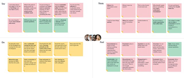
To visualise the insights, we developed personas representing different user types, their goals, and frustrations. We further deepened the analysis using an empathy map, categorising what users said, thought, did, and felt. Patterns became clearer, revealing the underlying strengths and weaknesses of each interface.

Navigation and findability as the UX cornerstones
One of the most significant discoveries was that findability and discoverability were the most critical aspects of RIPEstat's UX. With over 25 different widgets displaying various datasets, users struggled to recall names and navigate through the overwhelming amount of information. The UI 2013, despite its flaws, provided a more intuitive way to find data, functioning almost like a search engine.
Armed with this deep understanding, we developed a structured solution that prioritised efficient and simple navigation, helping users avoid the need to remember specific widget names while improving clarity, visual cues, and interactive speed.
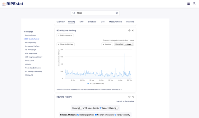
To improve navigation and reduce cognitive overload, we introduced horizontal topic-based tabs in the top centre of the interface, making it easier for users to categorise and locate widgets quickly. This replaced the long, dynamic side menu used in the UI 2020.
We redesigned the familiar tabs from the 2013 UI by flipping the original layout: vertical tabs became horizontal, grouping widgets by category across the top and enhancing overall usability. Meanwhile we added an "In This Page" vertical sidebar navigation to let users scroll through widgets without relying on memory. This minimised disruption for long-time users while improving speed and efficiency for everyone. In parallel, I refined filtering options for dynamic result updates and integrated visual cues - icons, colours, tooltips - to improve readability and interaction. Lastly, a modern, refreshed look improved the overall accessibility and usability of the UI.


Focusing on what works
Thanks to our extensive research, we confidently decided to retire the newer UI and focus entirely on improving the older interface. This decision was based on real user insights, not internal preferences. By consolidating efforts, we could enhance the user experience, reduce confusion, and allocate resources more effectively.
Looking forward, future iterations will focus on improving the style and usability of each individual widget, ensuring a cohesive, accessible, and user-friendly experience across the entire platform.
This project reinforced a critical UX lesson: design is not about trends, but about solving real problems. By putting research before assumptions, observation before quick fixes, and usability before aesthetics, we were able to guide RIPEstat toward a more sustainable and user-centred future.


Comments 0